July 2010—There are several new features in Adobe InDesign CS5 that photographers who do any kind of layout work are going to be incredibly excited about. Here are a few of the top features that will make you want to rush out and upgrade.
I should tell you up front—I love this new release. It’s a joy to use, and it actually makes layout fun. The project I’m currently working on is near and dear to my heart—my wedding invitations. My fiancé and I are creating them ourselves with his artwork and my skills at layout and design, and the new InDesign has made it a fun process instead of a frustrating one. I’ll take you through a few of the features I love about it, and how I used them to create what I think (but I’m admittedly biased) turned out to be some pretty amazing invitations.
Content Grabber. Drag an image around within it's frame to adjust the crop on the fly. No more jumping back into Photoshop just to make a small adjustment to part of the image. When you grab the center of the image now, the frame itself won't move—only the image within it. Original art © Gannon Ruddy.
The first one is small, but powerful—the ability to drag an image around within it’s frame to adjust the crop on the fly. No more jumping back into Photoshop just to make a small adjustment about what part of the image is viable. Called Content Grabber, when you grab the center of the image now, the frame itself won’t move—only the image within it. This was a helpful feature as I was moving around and placing the images in our invitations. I set up the bounding boxes and got the rough design done early; then, as the art was finished, I was able to bring it into InDesign and adjust it to get the exact part of the shot I wanted. Adobe didn’t leave it at that, however. Instead of having to wait until you’ve released the image to see what will be visible and what’s been cropped, a preview will show you exactly what’s still in the frame as well as a grayed-out preview of the portion that will be hidden from view.

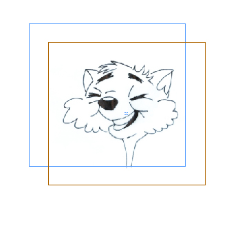
Live Corner Effects. Drag the tool to adjust the corners to get a rounded (default) effect, or press Alt/Option click on any of the yellow handles to scroll through the other corner effects. The default action is to do all four corners simultaneously, by the same amount for a balanced look. Hold down the shift key, to work on a single corner at a time. Original art © Gannon Ruddy.
Another nice addition to InDesign in this version is the ability to do custom shapes to the corners of images, again, without having to go into Photoshop to create the effect. Now, when you click on an image, a new yellow handle will appear in addition to the usual tools. Called Live Corner Effects, by dragging the tool you can adjust the corners to get a rounded (which is the default) effect, or you can Alt/Option click any of the yellow handles to scroll through the other effects built into the software. Once you’ve chosen one, you can adjust it to get exactly the look you’re going for. The default action is to do all four corners simultaneously, by the same amount for a balanced look. However, by holding down the shift key, you can work on a single corner at a time.
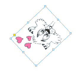
Rotating. Now, when you have an image selected, move your cursor to any of the corners, and a new rotate symbol will appear. Click and hold, and you can rotate the image as much or as little as necessary. Original art © Gannon Ruddy.
Again, in an effort to make repetitive tasks easier and faster, rotating is another feature that was tweaked. And it was the one feature I used the most in the creation of the invitations. Now, when you have an image selected, move your cursor to any of the corners, and a new rotate symbol will appear. Click and hold, and you can rotate the image as much or as little as necessary. Instead of going with a straight invitation style, ours are folded, with each flap folding out to reveal a new piece of art. In order to get the front and inside to flow correctly, there was a lot of rotating and adjusting. The ability to just grab and tweak instead of having to change tools and go through a process to get the angles I wanted was a huge plus in my book.
Auto-Fit is another new feature I used quite a bit in the invitation creation. Auto-Fit allows you to automatically scale an image to fit the frame, instead of having to do it manually. The scanned artwork came in as massive files that I didn’t want to shrink in Photoshop because I plan to use the same art in other stationary throughout the wedding. The ability to re-size my art in the layout, based on the frames I had preset, was a godsend, and saved me more time than I care to contemplate. To use it, turn it on in the Control Panel, then Shift-Drag the image to the size you ultimately want it to fit. Instead of just adjusting the frame, this will automatically set the picture to the same size and shape as the new frame.
On the production side, the Mini-Bridge is a fantastic new way to get quick access to all of your assets. It’s a little mini browser right in InDesign that allows you to find the art you want and quickly get it placed. It allows you to compare images and assets within InDesign instead of having to go out of the program and into your file browser. This doesn’t seem like a big deal, but when you’re in the middle of a project, it’s a huge time saver. I kept it open with the folder where my art for the wedding is stored not only for the invitations, but for all my stationary, so I could see at a glance which pieces I had ready to go, which ones I was still waiting to get the final versions for, and which ones had been used in any individual project.
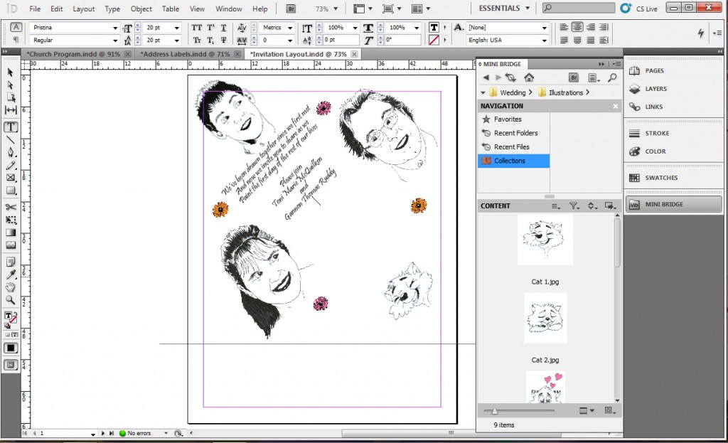
Mini-Bridge. The mini-bridge lets you view and access your assets within InDesign. Original art © Gannon Ruddy.
Another big win on the production side that’s not quite as noticeable or flashy is that Adobe took advantage of newer technologies and processors to export PDFs in the background. Especially on more complex projects, the ability to have InDesign exporting while you continue to work in the program on another layout is one of those time-savers you didn’t even realize was sucking so many minutes away from your day.
One of the nice parts about making edits in InDesign instead of going back and forth into Photoshop to get the same effect is that the original image remains untouched. The size, shape, resolution and any other changes made in the layout will allow you to get the look and feel you want without damaging or changing the originals. As I mentioned, we plan to use all of the art in more than one application, from wedding programs to table place cards to the thank-you notes, and all of these will be different sizes, require different angles, and would be a nightmare to keep track of if I had to create a different version of each piece of art for every use.
There are quite a few more new features that make layout much easier, faster and more efficient. Adobe has stayed with it’s pattern of making only minor changes in even-numbered releases, but in the odd-numbered versions, like the current one, they pack it full of new features and tweaks designed to really change the way you work. You owe it to yourself to at least take a look at the new version, and try it out if you can; since it’s packed with tools you’re going to enjoy using.
For more information, go to www.adobe.com.
|

